I’d love to be able to see a simple line graph of my test results for each parameter over time. That would be an easy way to look back and see how stable my FC has been over the whole season, for example. Or it would be an easy way to see at a glance if my TA or CH is trending up or trending down over time.

Pool math app feature request - graph of test results
- Thread starter Brett S
- Start date
You are using an out of date browser. It may not display this or other websites correctly.
You should upgrade or use an alternative browser.
You should upgrade or use an alternative browser.
- May 23, 2015
- 24,453
- Pool Size
- 16000
- Surface
- Plaster
- Chlorine
- Salt Water Generator
- SWG Type
- Pentair Intellichlor IC-60
It has been tested in beta versions of the App but it looks horrible and is very quirky. Right now there’s just no way to ensure a uniform visual experience across all platform types (phone, tablet, desktop). As the technology and programming better evolves, it will be revisited.
For now, you’ll just have to live with exporting data into CSV format and using Excel or Google Sheets to graph the data.
For now, you’ll just have to live with exporting data into CSV format and using Excel or Google Sheets to graph the data.
OMG... I would find charting on graph paper easier than Excel! Excel and I do *not* get along.
Actually, I kind like the idea of doing it old school....
Actually, I kind like the idea of doing it old school....
That surprises me a bit. If you need an example of how to display this data here’s a screen shot from the software that I use to manage my aquarium. The smaller graph on the bottom shows an overview of the results over a long time period and then you can use the buttons on the top or the sliders on the overview graph to zoom in to a smaller time period. It works well and displays well on my phone as well as on my iPad. I can add a screen shot from my iPad later to show how they scale it up.


- May 23, 2015
- 24,453
- Pool Size
- 16000
- Surface
- Plaster
- Chlorine
- Salt Water Generator
- SWG Type
- Pentair Intellichlor IC-60
Yes, those are very nice charts and we’ve tinkered around with charting options like that in the beta environment but there’s just no easy way to utilize the database we have as well as the highly variable frequency of test points (some people test daily, others weekly and some parameters are hardly tested at all) and to have charts that work well across multiple OS platforms (iOS, Android, Windows 10). And, as our developer likes to ask -
“What question are you trying to answer with the update you propose and does the update you propose actually answer the question in the simplest fashion possible and add value?”
You see, charting is a “nice to have” kind of feature but it doesn’t necessarily add any value to the data that isn’t already there or achievable by other means (ie, charting in Excel). Also, adding trend-lines connecting data points can be very deceiving as those lines are not based on reality (like a mathematical equation that defines an actual process) but are simply polynomial splines interpolating the data. So a graph like that may not reflect reality and there may be spiky-ness in between those points due to some situation that occurred that’s not reflected by merely connecting two data point with a smooth curve.
In summary, the PoolMath App is intended to be a tool that is as simple to use as possible and gives pool owners a way to store and review data. It’s also developed on a shoestring budget and so there’s limited bandwidth available to make substantial updates. Charting is definitely on the list of future upgrades but it’s only going to be implemented when there’s a good reason to do it and it doesn’t takes a lot of man-hours in coding to implement.
Feel free to send thoughts and update ideas (or big/issues) to [email protected]
mguzzy
Gold Supporter
 Bumpitty bump.
Any new thoughts on this? I understand the limitations from a coding perspective and data collection standpoint. Obviously more data points make for a better graph. Still...
It would be nice to see a graph of each measurement over time (pH, FC, CYA, TA, CH, sal, etc.). If they were overlayed on the same time scale you could see how the changes to one affect the other. Like TA and pH when adding MA. Ages ago I used to track everything on a big spread sheet and I would generate a graph of all the measurements overlayed as they changed over time. It really helped me visualize the interrelationships of the different chemical components. But after I put in a SWG almost 15yrs ago it got real boring as the FC swings disappeared from the manual CL doses. Though I could still see the effects of temp and bather load on my FC (time to turn the knob up) and the creeping pH.
Anyway that spread sheet is long gone and I got to thinking about it the other day while playing with the Pool Math app on my phone. I figured if I am going to start plugging in all my numbers here that would be a nice feature.
Just my two data points.
manfacro
0
redth
TFP Guide
- Jun 21, 2016
- 97
- Pool Size
- 84000
- Surface
- Vinyl
- Chlorine
- Salt Water Generator
It's somewhere on the list of things we'd like to add to the app. It's not really a coding or technical problem (we had internal versions with graphs galore in them), but more about providing something useful.
What questions are we trying to answer with graphs? We found most of the time that graphs had insufficient data points to answer questions we thought we could answer. This is also likely the case for the majority of users of the app. We instead think it's better to focus on the "Summary" section of the app where we've got some ideas to help provide more insight to your pool.
Right now we're going to focus on other efforts first where we can provide more value to more users... There's a bunch that we are working on:
- Helping first time users better understand the app and TFP methodology
- Apple Sign In (unfortunately this is a must due to Apple)
- Google Assistant integration ("Hey google, tell Pool Math I added 2 gallons of 11% bleach")
- SWG Automation (it's a pain to log entries each day for the SWG 'additions', we're figuring out how to make this better)
- Web app version
- Dark Mode
There's lots of work to do!
I personally see little to no value in a visual graph. I find the most current results most meaningful, and on occasion (rare) I suppose reviewing older results helpful but I can extrapolate what the numbers say without the visual. Am I missing something?
manfacro
0
Younger folks, with custom IOT devices are all about data logging. I'd love to be able to see my SWG settings overlayed with my FC readings from the past year so I know how my settings effect FC generation to time of year and sun exposure.
Same for salt, CYA and hardness against each other so can see water drains due to rain, or just CYA burn off do to heat. And plan chemical additions.
I feel we are moving more towards a data-driven world and people love to see trends and find meaning in historical data to help the future.
Same for salt, CYA and hardness against each other so can see water drains due to rain, or just CYA burn off do to heat. And plan chemical additions.
I feel we are moving more towards a data-driven world and people love to see trends and find meaning in historical data to help the future.
- May 23, 2015
- 24,453
- Pool Size
- 16000
- Surface
- Plaster
- Chlorine
- Salt Water Generator
- SWG Type
- Pentair Intellichlor IC-60
IOT = Internet of Things
(personally, I’d rather not have my water bottle connected to the Internet as staying hydrated is really none of Siri’s business...)
(personally, I’d rather not have my water bottle connected to the Internet as staying hydrated is really none of Siri’s business...)
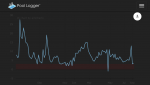
I will say that's why I use another service (poollogger) it calculates the same as pool math, but it has better data display plus graphing.
(FC graph attached)
How did your chlorine level drop into the negative range? ??

mguzzy
Gold Supporter
That would be a Neo-LudditeUh....what's an IOT?
I guess I'm a luddite.
") Unless your are a geriatric-luddite, that is someone you can't keep up with the times! welcome to the club. My kids call me a "boomer" and tease me because I prefer a phone with buttons....ironic because when their tech doesn't work they are on the phone to me. I still want to know when a fad became a meme?
Unless your are a geriatric-luddite, that is someone you can't keep up with the times! welcome to the club. My kids call me a "boomer" and tease me because I prefer a phone with buttons....ironic because when their tech doesn't work they are on the phone to me. I still want to know when a fad became a meme?I guess I spent to much time in the sciences in my younger days... I gain a lot from looking at a graph. I find it a lot easier to pick out longer term trends when visually represented in a graph. Granted you need to have the data points in order to resolve anything. But looking at the summary page is just one datum. An example.. when I was doing this charting years ago when I first got my pool. my FC values ranged wildly from manual dosing. It was easier to see how the pH readusted itself after the dosing in a graph and I stopped trying to control every change in pH with MA. When I added my salt cell suddenly the FC became more constant.. and all the other chemicals were easier to keep in check. It was also easier to see the onset of a bloom from the chemical additions to the pool. That sort of stuff. It would be nice to generate those visuals on the same device I am inputting the data. If I have to go through the hassle of exporting my logs to a spreadsheet so I can generate a graph.. I might as well just use the spreadsheet exclusively like I used to.What questions are we trying to answer with graphs? We found most of the time that graphs had insufficient data points to answer questions we thought we could answer. This is also likely the case for the majority of users of the app. We instead think it's better to focus on the "Summary" section of the app where we've got some ideas to help provide more insight to your pool.
Shirker
0
- Jul 2, 2014
- 749
- Pool Size
- 19000
- Surface
- Vinyl
- Chlorine
- Salt Water Generator
- SWG Type
- Pentair Intellichlor IC-40
Just remember, the S in IOT stands for Security.IOT = Internet of Things
(personally, I’d rather not have my water bottle connected to the Internet as staying hydrated is really none of Siri’s business...)
Thread Status
Hello , This thread has been inactive for over 60 days. New postings here are unlikely to be seen or responded to by other members. For better visibility, consider Starting A New Thread.