Trick for reading pH if you're colorblind

ChrisA76

Silver Supporter
Dec 1, 2022
53
East Bay, California
Pool Size
14400
Surface
Plaster
Chlorine
Salt Water Generator
SWG Type
Pentair Intellichlor IC-40
I specifically have Deuteranopia (red-green colorblindness) and it makes reading pH measurements painful.

So instead of struggling with color matching, I thought of a good way to read pH with a color picking app. Any color app that reports colors in HSV (hue, saturation, value) space is ideal since really you care about the hue and if you use RGB color space you'll have to do some non-trivial computations to match to the closest actual color while ignoring brightness.

1. Go through the normal steps with your test kit. On my Taylor it's fill up to the 44 mL mark, add 5 drops of phenol red, etc.
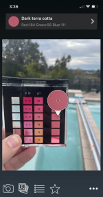
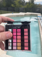
2. Hold up to the light and take a picture like below.
3. Load the image into a colorpicker app.
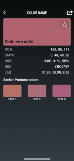
4. Use the colorpicker to find the Hue value of your water sample part of the image.
5. Find the closest hue value on the pH colorscale parts of the image. You can interpolate your sample color's hue between two pH scale color hue's if you want a little more accuracy if your sample falls between the hue values on the color scale. But I'd suggest against going too crazy with interpolation since with the same exact water, my pH varied by almost as much as +-0.1 with this method.

Example picture:
1670628934337.png

Screenshot from app:
1670629125798.png
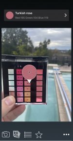
Turns out my water sample color here (Dark Terra Cotta) has a hue degrees of ~350 and,
IMG_5032.jpeg
the 7.6 pH scale color (Turkish rose) has almost exactly the same hue degrees, 350.

Incidentally, 7.8 pH on the color scale was 341 degree, the hue of 8.0 pH was 338 degrees. The hue of 7.4 pH was 5 degrees (same as 365 degrees), etc. Keep in mind that the absolute hue values will depend on the background you used, so they won't always be these numbers that I listed here. This is just an example.
 
@generessler I just now saw your thread on this from August. Hope this keeps you from having to develop it yourself. PM if you want the actual App that I used, I don't want to be seen as promoting any apps.
 
There's also a discussion about color matching pH in the thread below.

 
There's also a discussion about color matching pH in the thread below.

Thanks for pointing this out. I PMed Matthew from that thread about this one.

I personally tried the ColorQ Pro 7 2x and found it pretty unreliable in general. The same exact vials were producing different measurements over different trials with the same lighting and everything. It's possible that mine was faulty. I trust my Taylor kit, just not my eyes :).
 
Last edited:
  • Like
Reactions: guinness
@generessler I just now saw your thread on this from August. Hope this keeps you from having to develop it yourself. PM if you want the actual App that I used, I don't want to be seen as promoting any apps.
Thanks. Yes "hue" comparison in an HSV representation of colors is exactly what I had in mind. Only I was/am planning to use computer vision tech to pick out the blocks in the Taylor color comparator automagically so you'd just get the pH as output. It would be the same thing but I think more convenient and tunable. No fiddling with manual comparisons.

Anyway this would be a hobby project for my imminent retirement. :cool:
 
  • Like
Reactions: ChrisA76
@generessler I just now saw your thread on this from August. Hope this keeps you from having to develop it yourself. PM if you want the actual App that I used, I don't want to be seen as promoting any apps.
Chris,

Don't think there is any problem with you sharing the app that you used, might help some here if you did...
 
I didn't like my ability to choose either. I started taking one finger from each hand and blocking off the value above and below the one I wanted to see. I found it was way easier to say yes or no when not being influenced by the other colors.
 
  • Like
Reactions: Saturn94
To say a little bit more. If you click on the color name on the “What a color?” App it shows you this. Note the hue in degrees.


C5C48824-A090-41C2-B9BC-E655D24D4EB6.png
 
Last edited by a moderator:
Sherwin Williams should make an app that will allow you to get a paint color based on the color from the color matching app.

That way you can paint your house the same color as your favorite pH.

Then, you just hold the vial up to the house to see if it matches.

You can tell your painting contractor that you want your house to be painted a perfect 7.8 pH and they will know exactly what you mean.
 

Enjoying this content?

Support TFP with a donation.

Give Support
Great thread. Thanks for sharing.

When I check pH, I put a white card behind the comparator to get a purer color. I'm using my eyes, but the theory applies to your method, too. The white card will not only help "purify" the color, but it'll block other colors from leeching in that would otherwise affect the picker's reading.

The purity is less important, as you're really only concerned with hue difference, not the actual hue itself. But because both the comparator and the liquid are translucent, you'll get interference from anything visible to the color picker behind the sample. The white card will not only eliminate that issue, but will make the test much more consistent, because you'll always be measuring against white, instead of any of the large variety of colors of things in your yard. Worst case scenario is color-picking one cell that has something, say, blue behind it (like your pool water) but the other cell has maybe the tan deck visible through it. That'll mess with the picker's results.

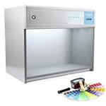
It's the same principle that necessitates the use of these types of gizmos when comparing colors: large boxes in which to view colors that eliminate interference from surroundings:

51W71WIs2QS._AC_SS260_.jpg

Test kit manufacturers should really paint the back of their comparators for this reason. Not sure why they don't. They could use a chunk of white plastic that lets in enough light to see the samples, but solid enough to eliminate color interference. They don't probably because this is all mostly unnecessary. Testing pool water isn't rocket science, close is close enough. So, ya know, you can safely ignore my ramblings! 😂

In my defense, I do color for a living, so I tend to be picky about picking!
 
Last edited:
When I check pH, I put a white card behind the Worst case scenario is color-picking one cell that has something, say, blue behind it (like your pool water) but the other cell has maybe the tan deck visible through it. That'll mess with the picker's results.
Yeah this is the main thing you have to get right when you take the picture. Using the white card is ideal but as long as the background is pretty consistent, it tends to work well.
 
Yeah this is the main thing you have to get right when you take the picture. Using the white card is ideal but as long as the background is pretty consistent, it tends to work well.
100%. And with the app that's easy enough. If you don't see the same background behind both sides of the squares, you just take another shot.

That said, I like consistency. It's why I don't test outside. I try to recreate the exact same testing conditions each time. I test indoors, in a room with no windows, with the same set of lights on each time. I use the white card to eliminate any background inconsistencies that might still remain. Again, this is somewhat overkill, considering most of those Taylor tests have a ± of 10% accuracy anyway, but good testing practices are, well, good practices. 10% is not great, so not making that error factor any worse is the goal.
 
  • Like
Reactions: JamesW
Now we just need a way to read the CYA test :mad:
Huh. Theoretically you could use the same color picker analysis of a photo of the "elusive black dot." All we are doing with our eyes is evaluating shades of grey. The differences between a black dot, a faded black dot (a tint of black) and no dot (a very, very, almost-white, tint of black). A color picker app could do that just as well as it does with colors. To the app, tints of black are still colors.

In fact, a color picker app would do a much, much better job of that than our eyes can (the physics of light and retinas is complicated to explain, but our eyes are prone to all sorts of interference getting in the way of seeing color and shades and tints accurately). It's why TFP had to come up with the "hold it at waist level and just glance at the dot" MO, which is an attempt to circumvent that same interference.

It wouldn't be all that hard to figure out how a specific grey color translates to a specific amount of CYA in your water. Or at least when a specific grey color indicates the dot is "gone." Taking a decent photo wouldn't be cake, but certainly doable.
 
Last edited:
  • Love
Reactions: KJB1
Huh. Theoretically you could use the same color picker analysis of a photo of the "elusive black dot." All we are doing with our eyes is evaluating shades of grey. The differences between a black dot, a faded black dot (a tint of black) and no dot (a very, very, almost-white, tint of black). A color picker app could do that just as well as it does with colors. To the app, tints of black are still colors.

In fact, a color picker app would do a much, much better job of that than our eyes can (the physics of light and retinas is complicated to explain, but our eyes are prone to all sorts of interference getting in the way of seeing color and shades and tints accurately). It's why TFP had to come up with the "hold it at waist level and just glance at the dot" MO, which is an attempt to circumvent that same interference.

It wouldn't be all that hard to figure out how a specific grey color translates to a specific amount of CYA in your water. Or at least when a specific grey color indicates the dot is "gone." Taking a decent photo wouldn't be cake, but certainly doable.
It’s a good idea. If you did this you’d want to use the V part of HSV and not the H (hue). And ideally you’d want to average over a window of pixels because while hue angle tends to be similar over nearby pixel, the intensities (values) can vary a lot from pixel to pixel.

Would be good to find an app that averaged picked color over a small window.
Photoshop's color picker can do that. Maybe their smartphone app can, too.

Some phone apps can blur an image, or a selection within an image, that would have the same effect of averaging pixels.
 
  • Like
Reactions: ChrisA76

Enjoying this content?

Support TFP with a donation.

Give Support
Thread Status
Hello , This thread has been inactive for over 60 days. New postings here are unlikely to be seen or responded to by other members. For better visibility, consider Starting A New Thread.