They appear to be smart dots. They know you’ve already seen the post (albeit possibly at a fast scroll through them without reading) and the dots disappear.I think I'm seeing dots go away on items I haven't clicked on, but are in the same thread as items I have clicked on. I get the logic of that. I could go either way.
Expected Downtime Sometime Soon
- Thread starter Leebo
- Start date
You are using an out of date browser. It may not display this or other websites correctly.
You should upgrade or use an alternative browser.
You should upgrade or use an alternative browser.
- Jul 21, 2013
- 65,308
- Pool Size
- 35000
- Surface
- Plaster
- Chlorine
- Salt Water Generator
- SWG Type
- Pentair Intellichlor IC-60
I just noticed something. The "Toggle BB Code" button in the post editor toolbar. Was that there before? I like the option, but I don't like that I can't use anything else in the tool bar while in BB mode. I don't think it worked that way before.
It is a new feature. It gives the default editor view more of a WYSIWYG and does not show BB code unless you ask to see it.
- I think I'm seeing dots go away on items I haven't clicked on, but are in the same thread as items I have clicked on. I get the logic of that. I could go either way. But I also think I'm seeing dots go away on items I haven't clicked on that are not related to anything. Kind of random. Anybody else seeing that? I don't think I can recreate that to study it, because once the system thinks the Alert item has been visited, there's no way for the end user to restore it as unvisited, so it's hard to diagnose.
Dots disappears when you view the alerted thread whether it is through the ALERT list or go direct to the thread.
The dot alerts at the thread level not if you view or bot view an individual message.
- Nov 12, 2017
- 12,652
- Pool Size
- 12300
- Surface
- Plaster
- Chlorine
- Salt Water Generator
- SWG Type
- Pentair Intellichlor IC-40
I think I like that. If an alert sends me to a thread, I tend to read to the latest post, so I will see/address all the latest posts. But depending on which alert I first respond to, I may not start at the earliest new post. I tend to address alerts from the bottom up for that reason.
And I'm good with that. I just want to be able to use the toolbar all the time, regardless of mode.It is a new feature. It gives the default editor view more of a WYSIWYG and does not show BB code unless you ask to see it.
mguzzy
Gold Supporter
I noticed if the dots are for Alerts in the same thread, and I click on any one of the Alert links, they all get cleared as being read. I figure this is by design.- I think I'm seeing dots go away on items I haven't clicked on, but are in the same thread as items I have clicked on. I get the logic of that. I could go either way. But I also think I'm seeing dots go away on items I haven't clicked on that are not related to anything. Kind of random. Anybody else seeing that? I don't think I can recreate that to study it, because once the system thinks the Alert item has been visited, there's no way for the end user to restore it as unvisited, so it's hard to diagnose.
I'm glad I am not the only one seeing the "hovering dots" issue. What browser are you using, is it chrome based or another beast?
Yea and whats with the tool bar auto disabling when you to BB mode. And what does "BB" stand for anyway? "Bobs Big Boy" oops that's BBB.. how about Blue Bayou or Burnt Bagel. Ok now I am rambling.
I always just look at the "alert bell" when signing on, to see threads I've posted on with new comments.
- Jul 17, 2019
- 4,070
- Pool Size
- 13000
- Surface
- Plaster
- Chlorine
- Salt Water Generator
- SWG Type
- Pentair Intellichlor IC-40
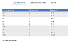
I also noticed that the FC/CYA chart was updated. One person already confused the target with their SLAM FC level this morning since that column moved to another tab.
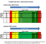
My 2 cents, we should move to a more visual chart that emphasizes that your minimum FC is truly the minimum, and that you can safely go above your published target amount. Here is my stab at a more visual chart, just using excel (I'm sure someone with more skill could make it much better):

My 2 cents, we should move to a more visual chart that emphasizes that your minimum FC is truly the minimum, and that you can safely go above your published target amount. Here is my stab at a more visual chart, just using excel (I'm sure someone with more skill could make it much better):

- Nov 12, 2017
- 12,652
- Pool Size
- 12300
- Surface
- Plaster
- Chlorine
- Salt Water Generator
- SWG Type
- Pentair Intellichlor IC-40
I'm on Mac Safari most of the time. It seems the blue dots are accompanied by a very light grey background behind the entire alert item. That grey color clears when the dots do. That's all good. But they chose the same color for that as the color the background changes to when you just hover over the alert item, and that's not good GUI. Visited, not-visited and hover should be three different colors.I'm glad I am not the only one seeing the "hovering dots" issue. What browser are you using, is it chrome based or another beast?
mguzzy
Gold Supporter
Does the site have any kind of auto refresh built in? It was always short.. and If I wasn't typing new notification didn't pop up unless I clicked on something. It seems like the new design has shortened whatever "active" page refresh setting there was. Or maybe it was just my imagination.
I tend to have a billion.. ok maybe more like a million tabs open as I work on other projects. And I would pop back into the site to see if there is anything new. I always have to click on "new posts" or something to refresh the alerts. Meanwhile my FB and email seem to refresh their pages and display basic "New Items" counts in the tab. If this is a setting you have control over, maybe you turned it off to save bandwidth for the users.
I tend to have a billion.. ok maybe more like a million tabs open as I work on other projects. And I would pop back into the site to see if there is anything new. I always have to click on "new posts" or something to refresh the alerts. Meanwhile my FB and email seem to refresh their pages and display basic "New Items" counts in the tab. If this is a setting you have control over, maybe you turned it off to save bandwidth for the users.
- Jun 22, 2014
- 52,028
- Pool Size
- 17888
- Surface
- Fiberglass
- Chlorine
- Salt Water Generator
- SWG Type
- CircuPool RJ-45 Plus
Same here Maddie. KISS principle.I always just look at the "alert bell" when signing on, to see threads I've posted on with new comments.
- Nov 12, 2017
- 12,652
- Pool Size
- 12300
- Surface
- Plaster
- Chlorine
- Salt Water Generator
- SWG Type
- Pentair Intellichlor IC-40
@JJ_Tex, I couldn't click on your FC/CYA chart to get a bigger view. I actually like the new TFP version, separating out the three use cases makes good sense. Reduces the clutter of unnecessary data, as 99% of the time users don't need to compare the three tables, only look at the one that pertains to them. What I like about your version is better differentiating between recommended and not recommended levels. I would have chosen something more subtle than the black box, but I get where you were going. Maybe a light grey background under slightly greyer text for the non-recommended levels, which would make the black text on white bg of recommended levels stand out.

I would also suggest the safe-to-swim indicator, while valuable info, doesn't belong on this set of charts. It's related, and maybe it's a footnote on just the SLAM chart, but it would be clutter on the other two.
I think the headings need some work, too. Not sure exactly what. You use Liquid Chlorine for a SLAM. Salt Water Generators produce chlorine. Needs clarity. Unfortunately I can only offer longer versions (shocker!):
Selectors:
- When Using Liquid Chlorine
- When Using a SWG
- When Performing a SLAM
Headings:
- If your CYA level is:
- FC level should never be below:
- Your ideal (target) FC level should be:
SLAM Headings:
- If your CYA level is:
- Constantly maintain FC level at:
I think a few extra words would make the charts more user-friendly (though maybe not small-screen friendly?).
Or the selector buttons could stay the same (or similarly short), and then add an explanatory sentence above each table, describing what each table is for:
- Use this table if you sanitize your pool with liquid chlorine.
- Use this table if you sanitize your pool with a saltwater generator (SWG).
- Use this table if you are performing a SLAM to clear algae.
Er sumpin' like dat dare.
Last edited:
- Jul 17, 2019
- 4,070
- Pool Size
- 13000
- Surface
- Plaster
- Chlorine
- Salt Water Generator
- SWG Type
- Pentair Intellichlor IC-40
Yes, I like the more subtle FC/CYA chart and mine is way too loud and not refined enough to be a final product. I was just hoping to get something that makes people scared to be below their minimum FC, and also know that they have a lot of wiggle room to go above the target FC. It seems like people commonly get tripped up on these 2 items when trying to understand the chart.
- Nov 12, 2017
- 12,652
- Pool Size
- 12300
- Surface
- Plaster
- Chlorine
- Salt Water Generator
- SWG Type
- Pentair Intellichlor IC-40
What happened to the "Start Conversation" button under each post, which then quotes the post in a new private message, already addressed to the poster. I use that all the time (just needed to and couldn't find it)!?
Last edited:
mguzzy
Gold Supporter
Yeah.. I would have thought it would be under the "share" icon.. but its not there either.
- Nov 12, 2017
- 12,652
- Pool Size
- 12300
- Surface
- Plaster
- Chlorine
- Salt Water Generator
- SWG Type
- Pentair Intellichlor IC-40
Yep, I looked there too. That would have been a place to hide it if Lee is trying to declutter, but no joy. Sorry, Lee, I know I must be driving you crazy. But I'm the kind of guy that will complain to the grocery store manager when they move stuff around. Why do they do that!?!
How's it go? The more things change, the more they stay the same? Then why don't they just leave them the same if the first place!?!

How's it go? The more things change, the more they stay the same? Then why don't they just leave them the same if the first place!?!
Click on the user and start convo comes up on their profile pop up.
But it’s just a direct PM that doesn’t automatically link the thread
But it’s just a direct PM that doesn’t automatically link the thread
- Nov 12, 2017
- 12,652
- Pool Size
- 12300
- Surface
- Plaster
- Chlorine
- Salt Water Generator
- SWG Type
- Pentair Intellichlor IC-40
Oh, that's new. I just copy/pasted that smilie from one part of my post to another and it turned giant. Now THAT I like! Is anyone else seeing that?

Yah, but that's not as handy. I used the Copy To Clipboard button under the Share icon, so those two together kinda make it happen, but the old button also filled in the subject, too. It was a nice feature. I hope it's just temporarily missing. Though I'm still reaching for that What's New link in the sidebar...Click on the user and start convo comes up on their profile pop up.
mguzzy
Gold Supporter
LoL.. Well said.. and where have you been at the curmudgeon meetings? Tonight we are discussing Covid safe ways of keeping the neighborhood kids off your lawn.But I'm the kind of guy that will complain to the grocery store manager when they move stuff around. Why do they do that!?!
How's it go? The more things change, the more they stay the same? Then why don't they just leave them the same if the first place!?
I know Lee is figuring out this new layout on the fly.. All the bugs are features.. and all the features are bugs. I bet its a button that needs to be enabled on his side.
- Nov 12, 2017
- 12,652
- Pool Size
- 12300
- Surface
- Plaster
- Chlorine
- Salt Water Generator
- SWG Type
- Pentair Intellichlor IC-40
Wha!?! How do I get on the mailing list for that calendar!?! I thought a pellet gun through a hole in a window screen would be the ticket, can't get any more socially distant than that! But apparently some mom's got all upset. MADD got involved (Mothers Against Demented Dirk). So now I'm looking for an alternate solution......curmudgeon meetings? Tonight we are discussing Covid safe ways of keeping the neighborhood kids off your lawn.
mguzzy
Gold Supporter
I used a potato gun.. that way I could always say I was trying to get the kids more vegetables.Wha!?! How do I get on the mailing list for that calendar!?! I thought a pellet gun through a hole in a window screen would be the ticket, can't get any more socially distant than that! But apparently some mom's got all upset. MADD got involved (Mothers Against Demented Dirk). So now I'm looking for an alternate solution...
Not far from the truth.. I have a friend with motion sensing sprinklers.. they keep the neighbor wild turkeys from over fertilizing his lawn. He's a curmudgeon too.. He moved to a rural neighborhood to be closer to nature.. just as long as nature is doing it on his lawn.‘Alexa, turn on the front sprinklers’.
Thread Status
Hello , This thread has been inactive for over 60 days. New postings here are unlikely to be seen or responded to by other members. For better visibility, consider Starting A New Thread.

