Coping Color Option

smitchell911

Member
Jun 10, 2020
14
Fulshear, Texas
Pool Size
16500
Surface
Plaster
Chlorine
Liquid Chlorine
Hello Everyone. I have been navigating my way around TFP website since June to educate myself on owning a pool. Very informative stuff on here and wanted to see if anyone has ever changed their minds on coping tile after installation? At the tile place, the stone looked much lighter and wasn't wet. We received some decent rain yesterday and looked outside to see more of a tan looking stone. To me, it just doesn't seem to match the split face and water tile we chose. We like those colors and want to keep them, but the coping tile may need to go. Any honest feedback is much appreciated. I plan on speaking to the PB this morning to see what our options are. Thanks in advance.

2"x 4" Nordic Silver Split Face
Keystone Light Travertine Coping
Master Tile - London (water tile)
 

Attachments

  • 6C5444B2-B838-4727-824E-5C781D678363.jpeg
    6C5444B2-B838-4727-824E-5C781D678363.jpeg
    444.9 KB · Views: 208
  • Spa.jpg
    Spa.jpg
    551.9 KB · Views: 209
The color will change when it is dry, wet, in the shade, sun and so on.. You will be able to change it out at a substantial loss to your pocketbook.. they will charge you to take out the coping and charge you for the new coping and the install...
 
Yeah, everything that Casey said. I know it isn't what you were looking for specifically, but the colors look good together. And honestly you will be the only one that thinks it is off. Everyone that visits your house will think it looks beautiful.

Definitely can be changed but you'll have to determine if that cost is worth it to you. I know where you are, as I have been known to spend a lot of money to make things exactly as I wanted, come heck or high water! I'm not stubborn, I promise! :laughblue:

--Jeff
 
  • Like
Reactions: KBR
Thanks for the input. The wife and I have been going back and forth on what to do. Will the Kooldeck change our perspective? Will the color of the pool give it a different look?
The small sample tile shown in the picture was our choice and thought that’s what we were getting.
 

Attachments

  • 5E96987A-1662-4342-9CA0-98D1157CD446.jpeg
    5E96987A-1662-4342-9CA0-98D1157CD446.jpeg
    576.8 KB · Views: 119
We are selecting tiles and stone for our soon to be build. Most of our stuff is coming from QDI but we also looked at Keystone. We selected QDI Light for the coping and a silver split face - both comparable to your selections. Personally, I like the contrast.
 
OK, you're not going to like my answer, but Casey made me say it! (Yep, that's what I'm going with!)

Now, this is with the caveat that we are all here looking at pictures on the internet, on our own monitors, and some of the those pics are taken at different times and locations. SO anything goes... but here's what I'm seeing.

The coping and the aqua edge tile look fantastic. Those are complimentary colors and definitely work together. Of the three, it is the grey-ish "bricks" that don't belong all that well to the color palette. And they look wildly different than they do in the first "swatches" pic you posted.

Now the bricks and the edge tile work together (grey and aqua blue). And there seem to be some smattering of colors in the bricks that kinda go with the coping, though not enough, and not quite all that well. But all three together are creating some visual tension (and that tension is what's bothering you). I don't necessarily agree that "only you will notice" is reason enough not to fix this. To me, that justifies the fix (if you can afford it). Not to stir the pot, but this will bother you forever, though you might learn to live with it. And to be clear, fair, it's not awful. Not at all. But it's not ideal, either.

The sample tile you placed on the existing coping does seem to work better with both the grey bricks and the aqua tile. Though it still has some orange in it, that fights a little with the grey (though much less so). That may or may not be true when either or both of the sample and the bricks are wet. Be sure to test that out.

I'm a little confused about the back wall, the brick above the tile. Is that a raised wall? Will the grey brick be above the water line? It is possible to stain stone. You could conceivable color the grey stone slightly to bring it inline with the color palette of the coping and tile. That should be a less expensive fix. I'm just not sure how well a stain will hold up to the pool water environment. Or how often it would have to be touched up (if at all). I have a guy I could ask, if that fix is a possibility for you. Definitely DO NOT use a colored sealer on that stone. That will become a nightmare. The correct fix is to stain the stone, the seal it with a clear sealer. Sealers wear, and if they are colored, subsequent resealing with more colored sealer will alter the overall color, and likely create odd patches of mismatched color. You color the stone, and then seal it with clear. Then subsequent resealing, with more clear, leaves the color alone.

If you decide to swap out the coping, you need to better manage the process. Sorry to rub salt in the wound, but this is what you missed the first time. It's not your job, the PB should have been in on this, or at least brought you in on this, but unfortunately attention to detail is a lost art. As you've discovered, tile lots don't always match. Even tiles within the same lot can be way out of place. You need to examine each tile, and even lay it all out around the pool, to determine if the colors are correct, to reject any klunkers that don't fit and to fit the color variations together such that they don't form odd-looking effects (like too many of one color together, or oddballs sticking out, etc). And you determine the definition of "match," and "klunkers." It's your money, it's your pool, you have to live with it. Precious few, these days, will care enough about this to do this for you. You order more material than you need, to give you some room to eliminate any offensive pieces. And you reject the whole lot if it's not to your liking. Some PBs will avoid this possibility by installing what shows up regardless, so they don't have to deal with "fussy" and so they can stay on schedule. They'd rather deal with the fallout and move on. It's not their pool, after all. I digress. The cost of "fussy" is TBD, and something you must negotiate with the PB, ahead of time. Or now, in your case. And I use "fussy" as something from the PB's perspective, not to discourage you from getting what you want. You have an eye, and you are particular. Nothing wrong about that. I am crazy fussy and have had contractors pass on work because they don't want to deal with my definition of quality. But I like what I like and I'm willing to pay for it. Or do it myself. Simple as that. So it's up to you.

So sorry this has happened. Here's hoping the solution, and its cost, will be something you can be happy with...
 
Last edited:
  • Like
Reactions: SoCali and Snoobug
Your input is very much appreciated and I welcome the honest feedback. Colors are not my thing, but after looking at the coping once the installation was complete and wet, I can't unsee it. I would have been perfectly happy with the small sample color since that doesn't stick out so much to me. We did request the PB replace one of the coping tiles since it was much darker than all the rest, and we are glad we did. You make a valid point in better managing the process of tile selection. It was just before the Christmas holidays and we were at the tile place on our own trying to decide color selection. A lot of trust is put in PB especially with years and years of experience. Extremely challenging process when you don't know what you are doing.

The swatches were provided by the tile company so I assumed this would be nearly identical when the rest of the tile showed up. It's been raining all day so the color of the water line tile, split face, and coping do show a different color as opposed to what it looks like dry. I totally get that and understand tile looks different in the sun or shade or when it's wet. Do the pool owners show up to the tile place to pick out the lot or just wait until it arrives onsite to determine what tile works best? That I am not sure of.

To answer your question regarding the grey wall. That is a 12" raised wall with Nordic Silver split face. Underneath the split face is our water line tile so I don't expect the water to reach the brick. With that said, we will most likely lean toward swapping out the coping with something much lighter color. The visual tension is definitely there and I am sure it will bother me until it's replaced. We also discussed moving the project along and coming back in 3-5 years to replace the coping. Still unsure if that's the direction we plan on taking or how much work/costs that consists of. Again, I appreciate the feedback and hope we can get this worked out in the end. If we do, I will definitely post pics.
 
That sample is quite a bit different than the actual thing. I know it's natural stone and they vary but one is a creamy white and one is yellow. I would use that to make a point with your PB. I think of you'd have gotten the sample you wouldn't have a problem with it.
 
  • Like
Reactions: elleb and B.lu
Do the pool owners show up to the tile place to pick out the lot or just wait until it arrives onsite to determine what tile works best?
It would seem most efficient to intercept the tile as early in the process as possible. The problem with that is the nature of color. What might look like one thing in a tile showroom or warehouse, can look like something else somewhere else. The only way to determine how it will look in your yard is to have it in your yard. The perception of color is influenced by its environment. Sun, shadows, wet, dry you've mentioned. But the color of surrounding elements plays a huge part, too. Your perception of the color of coping and tile and brick all affect each other, of course. But so do other things in your line of sight. The color of your house, the water, the sky, your fence, your plants, your furniture, all affect your perception of the colors of your pool's materials, along with everything else. For example, the colors of these pairs of inner rectangles are identical!

surrounding colors.png

And that is not even considering (and is a different effect than) reflections! Adjacent colors affect your perception, but colors reflecting off of other colors does too! Two different things.

It's just the way are eyes and brains work. And not all eyes and brains work alike. That's why some folks, including some here, can honestly say it all looks fine, because to them it does. When to others, like me and you, it doesn't look quite right. There's nothing wrong with any of us, it's just the way we are... Like how some of us sound great when we sing, and others think they sound great when they sing! :ROFLMAO: Or like how the colors are making you crazy, and maybe your spouse is thinking you are crazy! ;)

So get the new coping in your yard. Take each piece out of the box. Lay it out around the pool and spa. Watch it for a day or two. Get it wet throughout the day. Decide to keep or reject it. Then proceed to mix'n'match and swap each piece around until the overall effect is pleasing. Then instruct the PB and his crew to honor exactly the layout you've established. They'll either roll their eyes, or appreciate that you've eliminated the possibility that you'll be displeased with the end result, because it'll be on you. Or both. Who cares. You'll never see each other again!

But a final warning, that folks like you and me have to deal with. The more particular we are, by choice or genetics, the harder we are to please. Be prepared that no matter how hard you try, it might not end up perfect. And it might just look that way at 4 in the afternoon. Or during a cloudy day. Or whatever. Or... it might just look amazing to you all the time!! That's the plan, anyway!
 
Decided today I would drive up to the tile place for some help on what tile was purchased for our pool coping. Per the manager of the tile place, it favored more of the Pavers Romano Light Tumbled Versailles 3CM tile than the Keystone Light (which is what we requested). In order to confirm what was ordered I needed to reach out to the PB and request the PO so they could look up the exact coping tile that was purchased. During our time at the tile place, we looked and many options and soaked them with water to get a visual of what it would look like wet. Also grabbed a few additional samples to bring back home to see what they would look like against our waterline tile and split face.

Picture 1 - The sample on the left is Pavers Light Tumbled Versailles 3cm. The sample tile in the middle is what the tile guys picked up at the tile place, which was supposed to be Pavers Keystone Light Tumbled SET 3cm. The sample on the right is the actual Pavers Keystone Light Tumbled SET 3CM tile that was given to us at the tile place. The top tile piece was one from the lot that the tile guys cut that we took back to the tile place for further questioning. This piece was closer to that Pavers Romano Light Tumbled Versailles 3cm tile per the tile associate that was helping us. And this piece did not have the white grout.

Picture 2 - The same applies as above except I soaked all 4 tiles to see how they would look wet. To me, the 2 smaller samples changed very little, while the coping installed in the middle was the biggest change in color.

While the PB was out of the office during holiday season, I checked with our Sales Designer on which coping tile was included in the cost of our pool. Was told Light, "X", and "X". We new we didn't want the 2 "X" tiles so we started looking for the Light tile. You can see how confused we were as there were multiple Light options to chose from. After speaking to Construction Manager, he informed us it was the Keystone Light, but looking back on the contract it states Cross Cut Travertine 3cm Paver (standard light)

Still doesn't narrow it down to which exact tile. Anything other than the 3 options were considered upgrades. Will be looking to talk more about it with the PB to see what options we have, but right now I am leaning towards the Pavers Light Tumbled Versailles 3cm small sample on the left. Has anyone on here ever had to deal with replacing the coping after installation?

I did notice the guys installing the tile added white grout which I think makes the tile look pretty white while it's dry. Turns a tan color once it gets wet. Not sure if there is a sealant to put on the travertine that will hold that white color or not. I did find out that the PB is the ones who choses the lot and picks it up, not the actual pool owner.
 

Attachments

  • IMG_0649.jpeg
    IMG_0649.jpeg
    485.2 KB · Views: 99
  • IMG_0650.jpeg
    IMG_0650.jpeg
    403 KB · Views: 97

Enjoying this content?

Support TFP with a donation.

Give Support
Now, this is with the caveat that we are all here looking at pictures on the internet, on our own monitors, and some of the those pics are taken at different times and locations. SO anything goes...
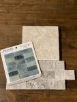
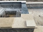
I quoted that line from my earlier post because those two pictures you just posted certainly are a good example of that warning. In those two pics, the installed materials all look great together. What looked to me to be a grey wall in the first series of pics you posted, now look to be a much better match. I'm seeing many tones of brown and tan, that I didn't see before, that go well with the installed pavers. And both look good with the aqua tile, which compliments all those same tones.

The point is, you can't rely on specific advice about color from the internet. The only thing that matters is what things look like in your yard, at different times of the day, and under different condition (wet, dry, full sun, shadows, reflections, etc). So the general concept stuff I gave you still applies. But only you can apply that to what you're seeing on site.

Based on these new pictures (and my computer and monitor), all the materials, the samples 
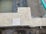
and those installed, all look like they belong to a pleasing palette. That said, the less color there is in the coping, (the more white it is), the less visual tension will exist (if any does), because white goes with anything...

Keep doing what you're doing. Compare samples in your own yard. Stare at them for a few days. One of them will speak to you. And when you settle on the material, if you decide to reinstall the coping, then my tips about laying it out and arranging all the pieces yourself would still be a good idea. Even if the new tiles are all a consistent color, going through each piece yourself will assure you that no clunkers get through. Like those with weird textures or cracks or chips. You're basically looking to eliminate anything that might bug you later. Things that wouldn't necessarily bother the tile crew, that they won't even notice.

To answer your question, no, I've never dealt with replacing coping myself, but others here have. So I know it can be done. It'll be quite a demo process, for sure. If you do lay out the new tiles yourself, you should number them on the back side, as they will get moved for the demo and your careful considerations of which go where will likely get lost in the shuffle. If numbered, the tile setter will have an easier time of restoring your layout work. You could even include an arrow, that points at the pool, so the installer will have no question about which direction to lay each tile.
 
That sample is quite a bit different than the actual thing. I know it's natural stone and they vary but one is a creamy white and one is yellow. I would use that to make a point with your PB. I think of you'd have gotten the sample you wouldn't have a problem with it.

Thanks for the feedback! If the color of the tile didn’t drastically change from when it was dry to wet, I would be fine with it. We went to the tile place and soaked everyone of the tiles and they didn’t change that much compared to the hats installed on our pool. So not sure if there is something done to the tile to hold the white color or not.
 
  • Like
Reactions: Nikilyn
There are sealers that would minimize or eliminate the color changing from dry to wet. But they may make the wet color permanent, not necessarily the other way around, and the color effect that the sealer adds (if any) would not necessarily be the same that water would affect the color. You'd need to purchase tile samples and experiment with sealers to find the combination of stone and sealer that gets you the desired result. This from my stone guru, who does this exact kind of work regularly. He never trusts anyone telling him what to expect of a material or a stain or a sealer, he tests whatever he's going to do before he does it.

Sealing would need to be a maintenance item, ideally once a year. It' a good idea to seal stone anyway, so this would be effort well spent even if color wasn't an issue.

I realize how daunting that sounds. But that is the absolute correct, sure-fire way to get what you want. PBs and even tile setters might not have the skill to perform this process. My guru is highly specialized, and very expensive, because he gets the results that high-end, super-fussy clients want.

Would you notice the difference between that level of care vs you taking a best guess of the tile you want and the PB (or you) slapping down whatever sealer you come up with? There's no way to know that ahead of time. One way will get you what you want for sure, the simpler path may or may not, or may be close enough...

Don't shoot the messenger!! 🤪
 
Last edited:
What are the plans for the decking material? I tend to favor a darker coping that picks from the darker shades of any stone product used. You want to highlight that for the best look. The coping should always be louder than the stonework or compliment it. The only contrast out of that is a blingy or bold waterline tile, that's its own thing, you can get away with almost anything there and not look out of place
 
What are the plans for the decking material? I tend to favor a darker coping that picks from the darker shades of any stone product used. You want to highlight that for the best look. The coping should always be louder than the stonework or compliment it. The only contrast out of that is a blingy or bold waterline tile, that's its own thing, you can get away with almost anything there and not look out of place


Thanks for your feedback! Unsure on what color we plan to go with on the KoolDeck. Color options will be here tomorrow morning and we’ll have about a week to pick a color we want. Our brick on our home is light brown and was told to factor that in when deciding on a color. PB definitely thought the coping was a bit darker than what he was used to working with.
I think the tile is a bit more of a walnut color. If we decide to stay with the coping we have, we may go a shade light or a shade darker on the KoolDeck color.
 
Good Afternoon - I do have some updates since my last post. I need to grab some updated pictures first. But in the meantime, I was able to get the PB out onsite to take a look at the stone used for the pool coping. He agreed that it was much darker than the typical stone they are used to installing. He agreed to take care of this issue and the following day he informed me that the was holding the stone in my name at the tile place. My wife and I went up to the tile place and was pretty close to the sample color we initially picked out.

A couple of days later the tile guys were out ripping up the existing stone and installed the new stone a day later. We still have grout to put in and have yet to pick a KoolDek color. We are planning to go with a white grout and either Cabo Beach or Caribbean Cream color for the KoolDek. The color grout that was previously used on the coping was called Antique. It is my belief that this color grout made the stone look much darker than the original color. I will post new pictures soon.
 
First pic: Stone on the far left was the existing stone that was installed around the entire pool/spa. The stone shown in the middle is the current stone that is installed around the entire pool/spa. The smaller stone is the sample we were given at the tile place. This pic was taken while dry.

Second pic: Same as pic 1 description, but now wet.

This pic was taken on a somewhat cloudy afternoon. The PD couldn't figure out why the existing stone on the spa was mush lighter than the stone around the pool. That goes back to my grout comment. I believe a lighter\white grout was used on the spa and the Antique (looked chocolate when wet) was used around the pool, giving it a darker color. The new stone that was installed yesterday does have some pieces a little bit darker and a little bit lighter. I think the new stone looks great and the wife and I are both pleased with the outcome so far. As some folks have stated before, pictures on the internet are sometimes tricky. Actually seeing it with my own two eyes, I see a distinct difference in the two stones. Hope this helps.
 

Attachments

  • IMG_0953.jpeg
    IMG_0953.jpeg
    663.9 KB · Views: 66
  • IMG_0956.jpeg
    IMG_0956.jpeg
    631.7 KB · Views: 65
Glad it worked out for you!

If you can, please post pictures of your coping with decking once complete. I'm really interested in seeing how it turns out. We're still waiting on HOA approval so have plenty of time to change selections and finishes if necessary.

Thanks!
 

Enjoying this content?

Support TFP with a donation.

Give Support
Thread Status
Hello , This thread has been inactive for over 60 days. New postings here are unlikely to be seen or responded to by other members. For better visibility, consider Starting A New Thread.